The Democrats released their 2012 Convention logo:
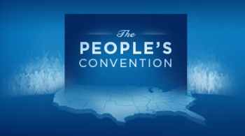
Look familiar? Here’s the Democrats’ Obamacare logo:
![]()
What’s changed? Well, now America has become a soulless, barren, depopulated wasteland. The few people left alive have been quarantined in Canada behind a 50 mile high wall.
I guess the Obamacare dome that protected everyone in the bottom picture actually ended up decimating the population, thus the wasteland.
Funny thing is, the ghostly people in the Convention logo look a lot more agitated than the ghostly people in the Obamacare logo. Maybe they’re just trying to say that their vision is to exile the Tea Partiers to Canada, and transform the Lower 48 into a Borg-like collective of group-thinking, obedient, blue-state liberals.
Either way, it’s an unnervingly creepy piece of symbolism.
By the way, does anyone else think that Obamacare logo looks like a Tsar Bomba strike on Minneapolis?
[Hat tip to American Glob, which has a less cynically paranoid view.]
Pingback: Imitation Is The Sincerest Admission Of Failure » American Glob
Kind of like “The People’s Army” or “The People’s Republic of…” – they’re not even trying to hide the socialist message anymore.
Gives me an idea, what if we give all the socialists a goverment paid for vacation to Europe. Stay with me, while they are gone…. we change the locks.
There can be a difference between what you and a health insurance company consider healthy. Some insurers will say that you have a health condition if you smoke, are overweight, are taking prescriptions, or had a medical condition in the past. If this describes you, you may want to search and read “Wise Health Insurance” on the web.
Oh, they are really not trying to hide who they are. Check it:
http://en.wikipedia.org/wiki/Convention_People%27s_Party
How about another one? http://en.wikipedia.org/wiki/People%27s_Convention
That Obamacare logo looks like a winged skull brooding over a river of blood seen through a toilet seat lid… or a mushroom cloud over Minneapolis, yeah. Who decided that a washed-out, pale blue America populated by white ghosts would best represent the ‘inclusive’ party?
Just like the Democrats to build a wall on the Northern border when most of the troubles are on the Southern one!
Son of Bob beat me to it. It’s scary how blatant it is. You get the feeling they’re just a little PO’d that the Dems get blue and the Repubs get red?
I hope it’s just a zombie horde sweeping south. At least i know how to deal with a zombie horde. much easier than dealing with socialist, but many of the same rules apply.
The only thing missing on the Peoples Convention logo is a hammer and sickle.
Isn’t there some rule or law that says that anything that is titled “The People’s ________” is a communist organization?
Maybe it is just me, but the people’s convention will put ghostly, identical looking white people second as it seeks it’s co-objective of subjugating America. That is what a year and a half of liberal literary classes will do. I must be right.
“….they’re not even trying to hide the
socialistcommunist message anymore.There, I fixed it.
Are we still allowed to say let’s call a spade a spade? probably not.
It’s ironic that places called “The People’s……” are anything but.
How about calling it The People Who Don’t Work’s Convention?
Ok…all you People should sit down and shut your yaps! Our Dear Leader (May He Live Forever) is brilliant and such clever blue posters are also. You are just too dumb to see it because you are rubes in middle America! Oh that you could truly be part of the elite (Washington D.C.) you would raise your hands in joy over these truly Hopeful and Changing Symbols for The People of America! Now, go back to your lives with joyful faith in The One in whom we should all be grateful for our food, medicine, cars, banks etc.! We should not be critical of someone who loves his People as much as He does and works so that we may serve him to show our total good feelings and such!
What he said.
You call it ghostly and creepy, but it’s designed that way to avoid counterfeiting. You really cannot photocopy the thing to pass ’em around (which is not altogether a bad thing).
This image is actually the background for Democrat Convention “Bonus Bucks!” that they’ll be able to use like cash for buying the T-shirts, caps, coffee mugs and all that other Obama crap and Convention paraphernalia at the booths.
Even in the picture the Party is bigger than the People.
I don’t think it was intentional. I think it’s been part of their subconscious for years.
I googled “democratic convention 2012″… and sure enough, they are actually calling it “the people’s convention.” I honestly thought the guys at IMAO photoshopped the logo to add the phrase. Which brings us to warning sign #68324 of an out-of-touch government: the government’s PR campaign is indistinguishable from a parody of the government’s PR campaign.
The placement of the ominous sphere of depopulation over Minneapolis makes sense, since this is Michele Bachmann’s territory, and last I checked, the screaming monkeys
employed byin charge of CNN were not very happy with her. Unfortunately for me, I’m actually in Minneapolis for college. Any advice to avoid being de-populated?People’s Convention? That must refer to the unelected 20% of voting delegates at their convention. These “super delegates” are known for voting in the people’s best interests, whether the people agree or not.
Harvey alluded to this difference, but the ghostly people in the convention logo almost look like a ravenous zombie horde bent on eating the life out of America.
Oh, come to think of it, I guess it’s supposed to look that way…
My first reaction was that it looks like a tombstone. To their credit it just may be the most user friendly logo to lol-ter-ist of all time.
The People’s Temple…yeah drink the Kool-Aide.
The People’s Car…sieg heil! Wouldn’t that be the Volt?
The Obamacare logo looks like a mushroom cloud…
Why do I feel I’m the only person who is taking interest in the Superbowl?
It has a definite Soviet ring to it.
#24 – Corona,
Green Bay wins! Oo-Rah!
5 – My comments here:
http://badexample2.blogspot.com/2011/02/update-2-6-11.html
Probably should check out the link in that post for full context.
It would of made more sense to put the people on the American side of the (Berlin) wall. They are going to have to force us to stay in the new “People’s Republic” if they stay in power. Canada will become the new West Germany.