Say… anyone ever notice that if you take the GlobalWarmer’s Hockey Stick Graph:
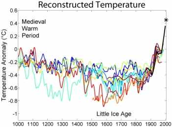
and change the labels on the x & y axes, you get a graph of insurance premiums in America?
Say… anyone ever notice that if you take the GlobalWarmer’s Hockey Stick Graph:
and change the labels on the x & y axes, you get a graph of insurance premiums in America?
Hummmm…looks like a modern art rendering of the Rocky Mountains.
. . . Or 4of7’s rendition of the idea of bacon sizzling in a pan.
(With all due affection!)
Hmmm… Random temperature fluctuations, depicted graphically, as the foundation for a work of art?
It might just work!
(It’d certainly work better as a work of art than as the foundation for a world-wide take over of the economy in support of a baseless hysteria posing as a secular religion.)
Just sayin’…
Wait a second… I recall in the late 70s, we were being lied to that an ice age was coming. By looking at that graph, I don’t see how the pointy headed smarty pants people could have come to such a conclusion.