That’s because they have degrees in B.S. (bull stuff), M.S. (more of the same) and PhD’s (Piled higher deeper). I am NAACP. (not actually a cracked pot.
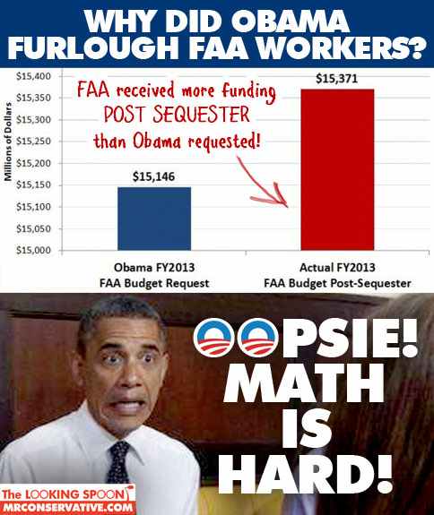
The point is valid, but that graph is terrible. Why does the vertical axis range from $15M to $15.4M, a value roughly 2.6% higher?
Seriously, using a Bacon-scale rating from 1 to The Amount of Bacon They Feed Osama Bin Laden in Hell, I give that graph a rating of -[Avogadro’s number]. Our best argument against the hippies right now is mathematical literacy, and if we throw that away to make cool looking graphs that mischaracterize our point, I might switch sides since at least the Libs want to make it easier for Sandra Fluke to not reproduce.
“Why does the vertical axis range from $15M to $15.4M?”
Because the numbers being depicted are between $15M to $15.4M.
If the percentage of difference between the numbers was better for making their point, I imagine they would have used a vertical scale showing from 1 to 3 percent — still showing an increase.

YGDFTYLTATSOTE
(And all that other Purge-related nonsense.)
For this administration math is hard…lying isn’t.
That’s because they have degrees in B.S. (bull stuff), M.S. (more of the same) and PhD’s (Piled higher deeper). I am NAACP. (not actually a cracked pot.
The point is valid, but that graph is terrible. Why does the vertical axis range from $15M to $15.4M, a value roughly 2.6% higher?
Seriously, using a Bacon-scale rating from 1 to The Amount of Bacon They Feed Osama Bin Laden in Hell, I give that graph a rating of -[Avogadro’s number]. Our best argument against the hippies right now is mathematical literacy, and if we throw that away to make cool looking graphs that mischaracterize our point, I might switch sides since at least the Libs want to make it easier for Sandra Fluke to not reproduce.
“Why does the vertical axis range from $15M to $15.4M?”
Because the numbers being depicted are between $15M to $15.4M.
If the percentage of difference between the numbers was better for making their point, I imagine they would have used a vertical scale showing from 1 to 3 percent — still showing an increase.
on a related note, all furloughed workers were non union, no union workers were in danger of being furloughed.
Bacon to Bunkerhillbilly!
http://tinyurl.com/YGDFTYLTATSOTE